Equilibrium in motion.
Nash resolves real-world complexity into the best possible outcome — continually adjusting in a world that refuses to sit still. Not by avoiding complexity. By mastering it. Beautifully. Relentlessly. In motion. Always.
Our mantras
Five principles behind every asset Nash produces. A system in motion, not a stamp on a page.
A geometrically disciplined mark
Designed for variable states. Constant in shape, dynamic in behavior. A living object — a snapshot of equilibrium in motion.
A restrained color system
Nash Chartreuse earns its place; used like a signal flare or a laser pointer, appearing only when Nash intervenes.
Imagery that shows contrast
We show the world as it is — friction, chaos, scale — and highlight the Nash difference inside it.
Motion that behaves like physics
Chromatic aberration, interference, superlattices. Motion is not a flourish — it is the visible trace of optimization at work.
Materiality
In a world of AI slop, we are fascinatingly real. Perspex, glass, metal, light. Tangible objects are brand assets.
The wormhole
A bounded, fragile, hard-won configuration where complex systems briefly resolve into coherence. The metaphor that runs through everything Nash makes.

The Continuum Mark
Derived from the mathematics of spacetime geometry, expressed as a bounded region where distance, orientation, and adjacency are redefined. Intentionally ambiguous — resisting a single, fixed reading.

Behaviors — the mark is not a stamp

Construction
The Continuum Mark is mathematically constructed — the top square tilts in 3D space but is always confined within a 2D hexagon. The top square is ≈30% smaller than the front square, for rule-of-thirds balance.


Wordmark
Not an off-the-shelf font. A customized variant of Rina, a modern geometric sans. Letterform junctions were given the same rounded radii as the continuum mark. The arc of the "n" and "h" became the neck of the wormhole.
Color
Seven primary blues. Three chartreuses. Restraint is the system. Chartreuse shade follows the weight of its blue — bright on dark, dark on light.
Primary blue
Nash Chartreuse
The pairing rule
The Nash Flash
Chartreuse never appears in body text, em, stats, tables, or link hovers. It signals the precise moment Nash has intervened — a signal flare of chaos coming into order. Used everywhere, it means nothing. Used rarely, it means everything.
Contrast — WCAG pairing
Computed contrast ratio for every text-on-background pair. AAA = 7+ (any size). AA = 4.5+ (any size). AA-LG = 3+ (≥18pt or ≥14pt bold). FAIL = below 3.
Typography
Host Grotesk is the voice. Geist Mono is the instrument panel. Instrument Serif is reserved for rare editorial moments where we slow down and mean it.
Host Grotesk · Primary
The quick brown fox jumps over the lazy dog. Logistics, mastered — continuously, in real time, against your objective. Weights 300–700, variable axis.
Geist Mono · Instrument
Stat numbers · oversized
Spacing scale
8-step grid · base unit 4px
Radius scale
From the live website CSS
Motion
Motion at Nash is not a flourish. It is the visible trace of optimization at work — the mark sensing, absorbing, rebalancing. Three canonical behaviors.
Ferrofluid inside the frame
The mark morphs like a ferrofluid bounded by its invisible hexagon — reshaping internally while its envelope holds.
Stretch and snap back
Under tension the mark stretches and snaps — a wormhole changing shape as forces arrive and resolve.
Impacting what's nearby
Like light pulled into a black hole, adjacent trails, motion, and texture bend toward the mark — not vice versa.

Aurora
Nash's primary atmospheric treatment. Soft chromatic light bleed used in heroes and key art — the moment before the wormhole resolves. Click below to generate your own in any aspect, color variant, or motion format.
Aberration
Variation is information. When the logo vibrates, blurs, refracts, or splits into color channels, we are making visible the invisible work the platform is doing — sensing, absorbing, rebalancing. Where others polish imperfection away, Nash foregrounds the physics.
Jolt — one-shot aberration
For state changes: a 550ms decay that signals "the system just moved." Strike at peak (red/blue split + chartreuse halo) snaps in, then a soft ease-out resolution settles it. Use sparingly — on confirmation, on resolution, on the moment Nash intervenes.
Decay 550ms · easeOutQuint · Offset 3px · Halo chartreuse
The logo is not a stamp
It is a living object — a snapshot of equilibrium in motion. Variation tells you something about the state of the system.
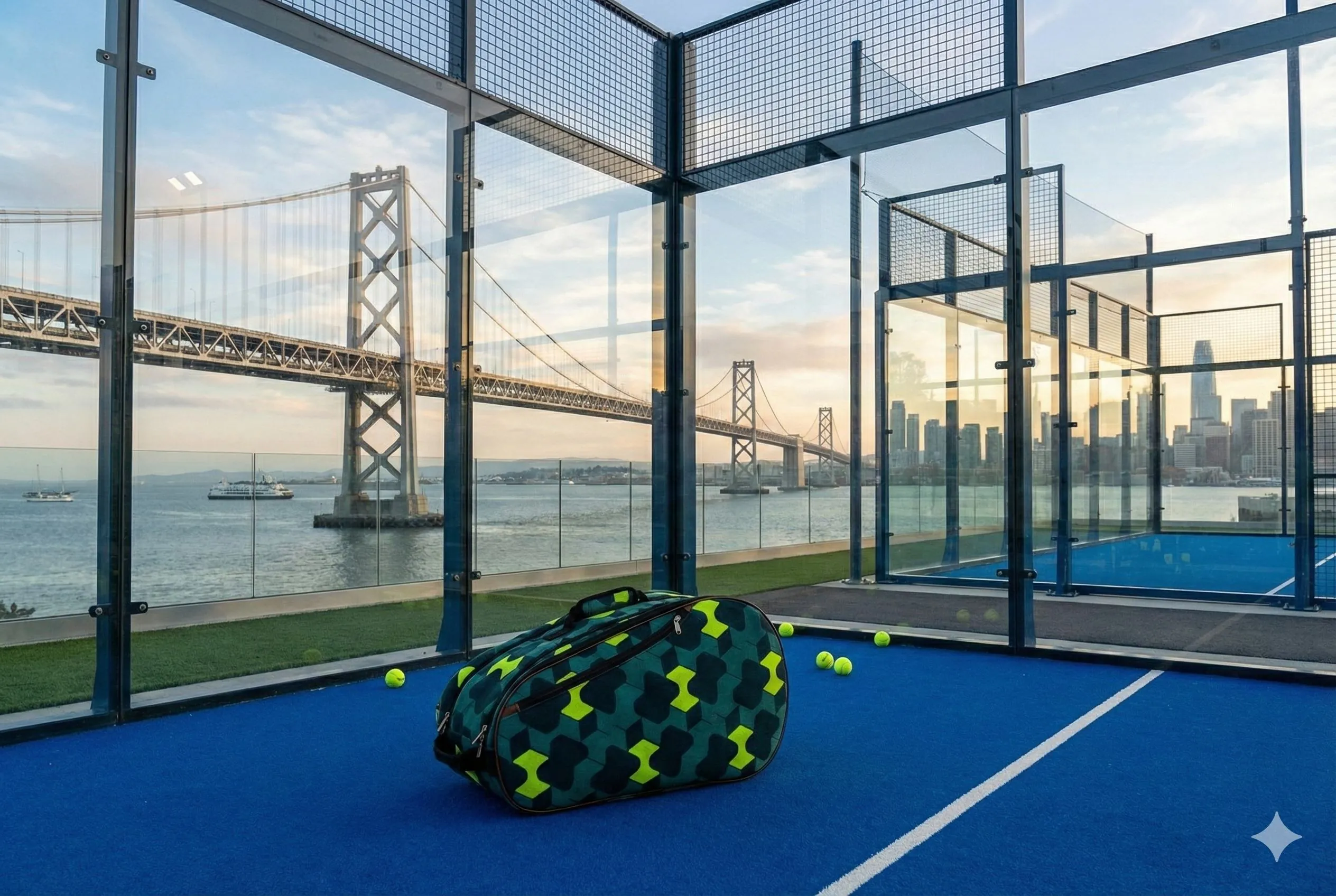
Photography
The real world, captured in motion. Physical environments and human-scale logistics — speed, friction, imperfection — then resolved through structure and clarity. Where possible, shot at customer locations.
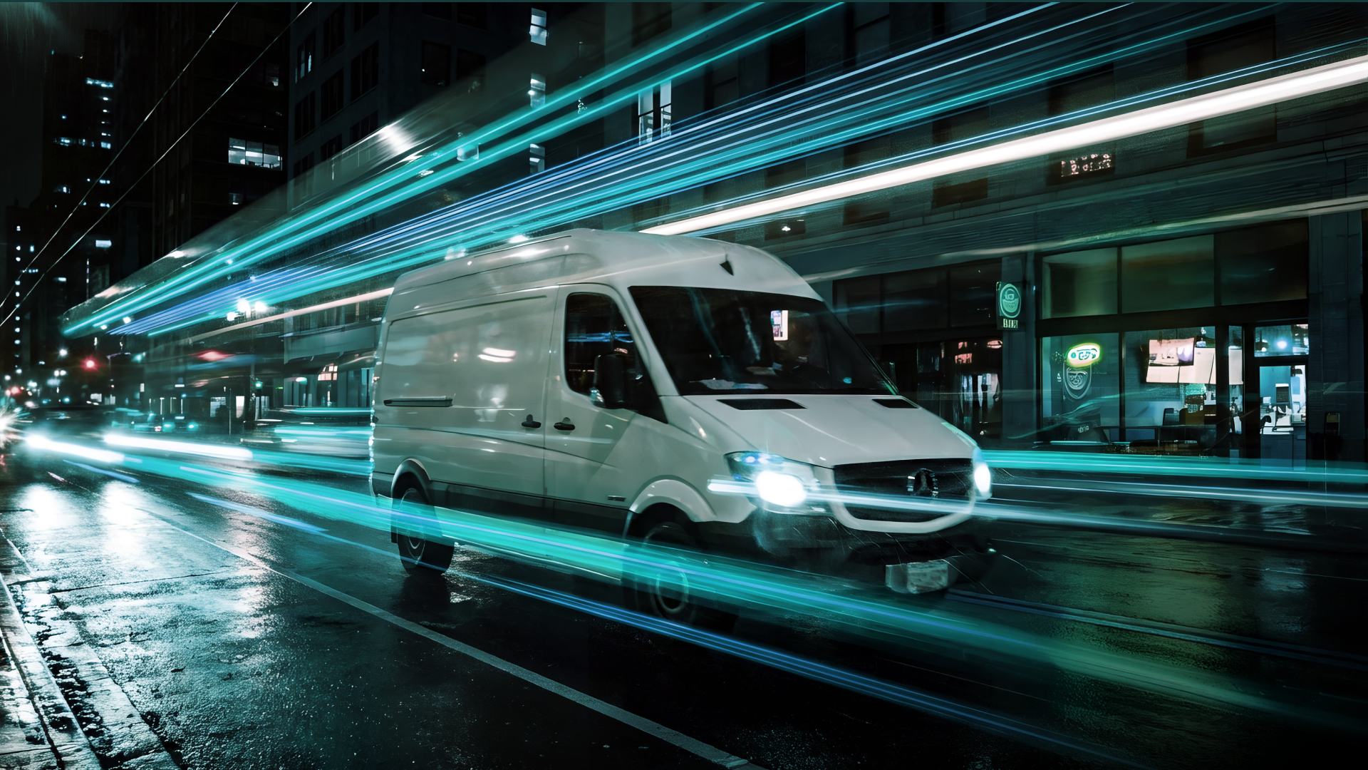
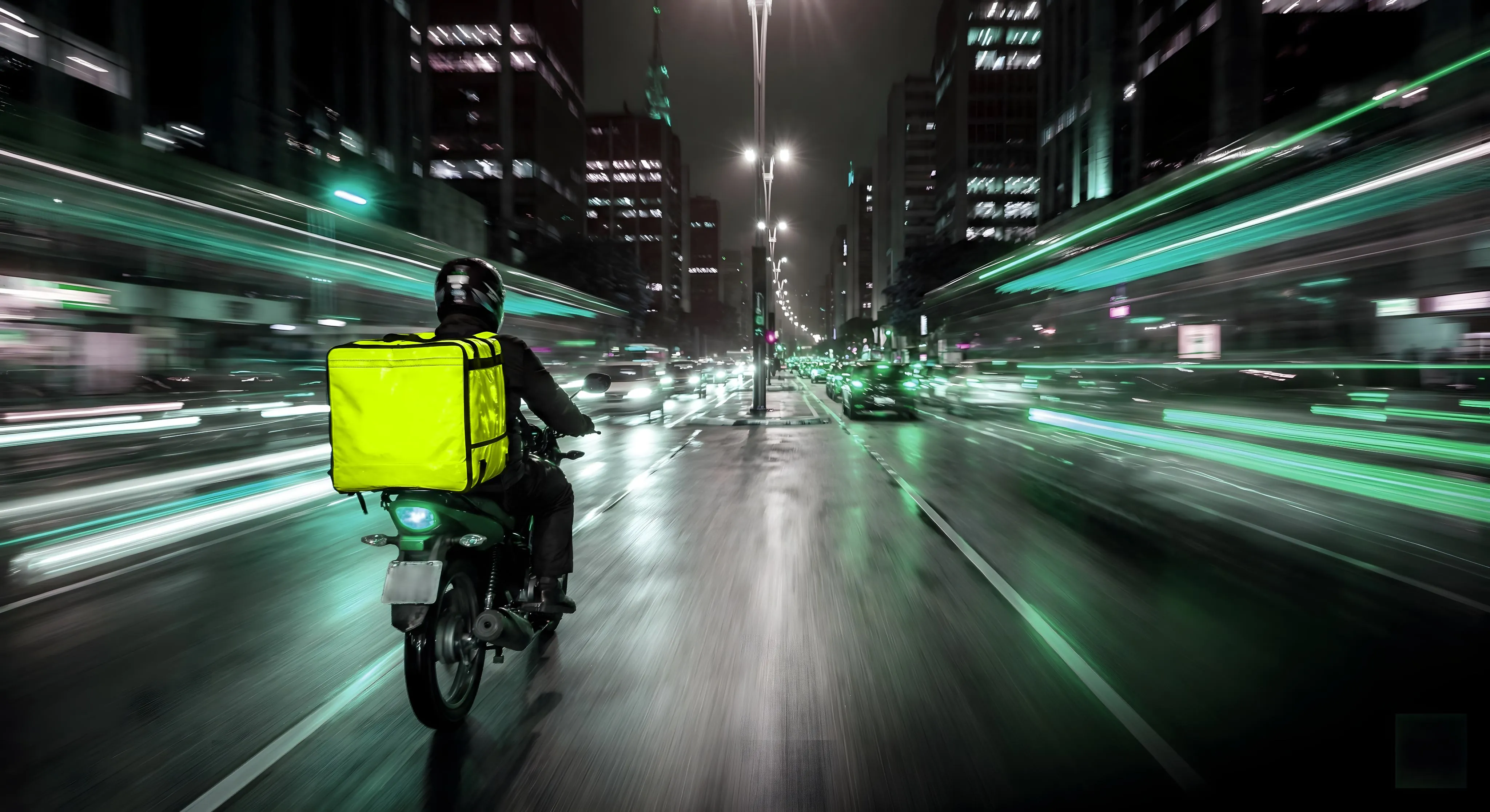

Motion blur, long exposure
Chaos and speed belong in the frame. Nash is the moment of focus inside them.
Vibe stamp, not corner stamp
Logo sits bottom-right, read last — so the feeling of the image arrives before the brand does.
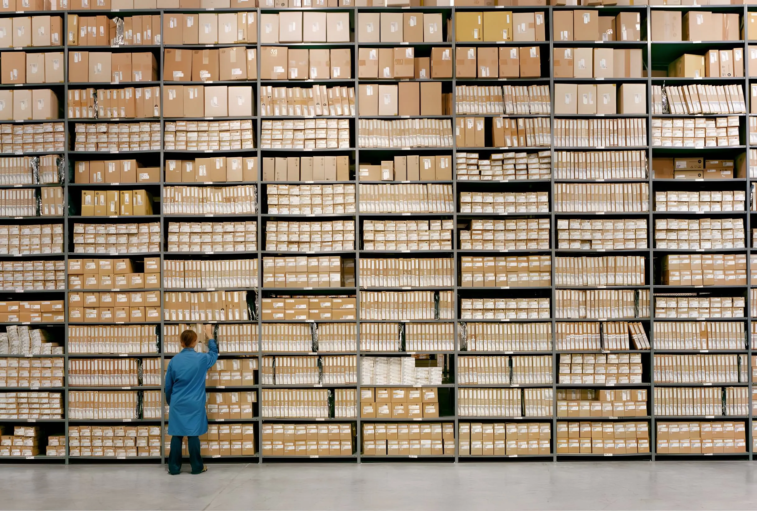
Human scale, huge systems
We show infrastructure at its actual size — and put a person, bike, or pallet inside it for reference.
Illustration
A single illustration thesis: show the world how it was, then show the Nash difference. Classical scenes, vintage engravings, found art — interrupted by a single chartreuse Nash element. The signal flare across centuries.
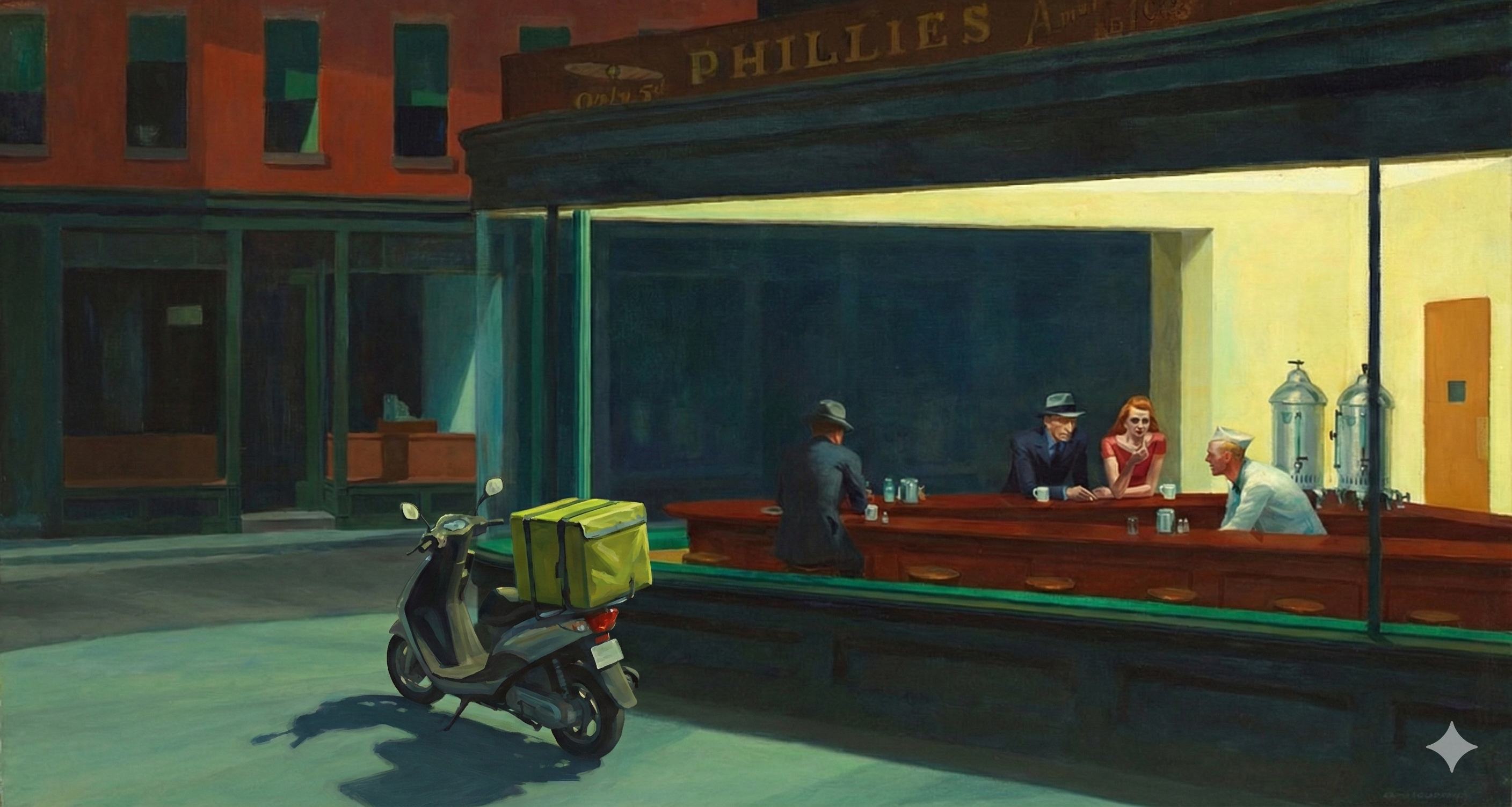
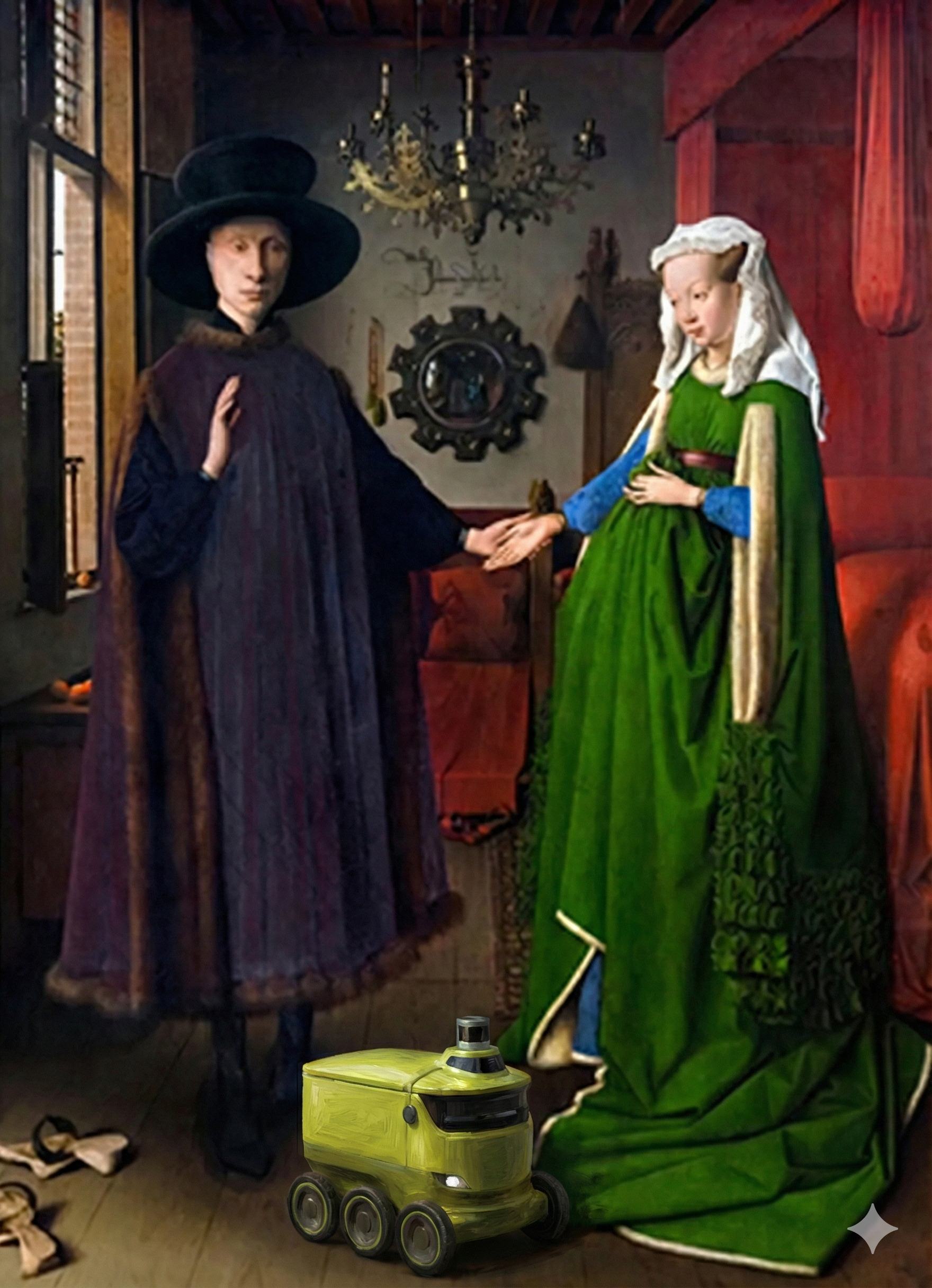
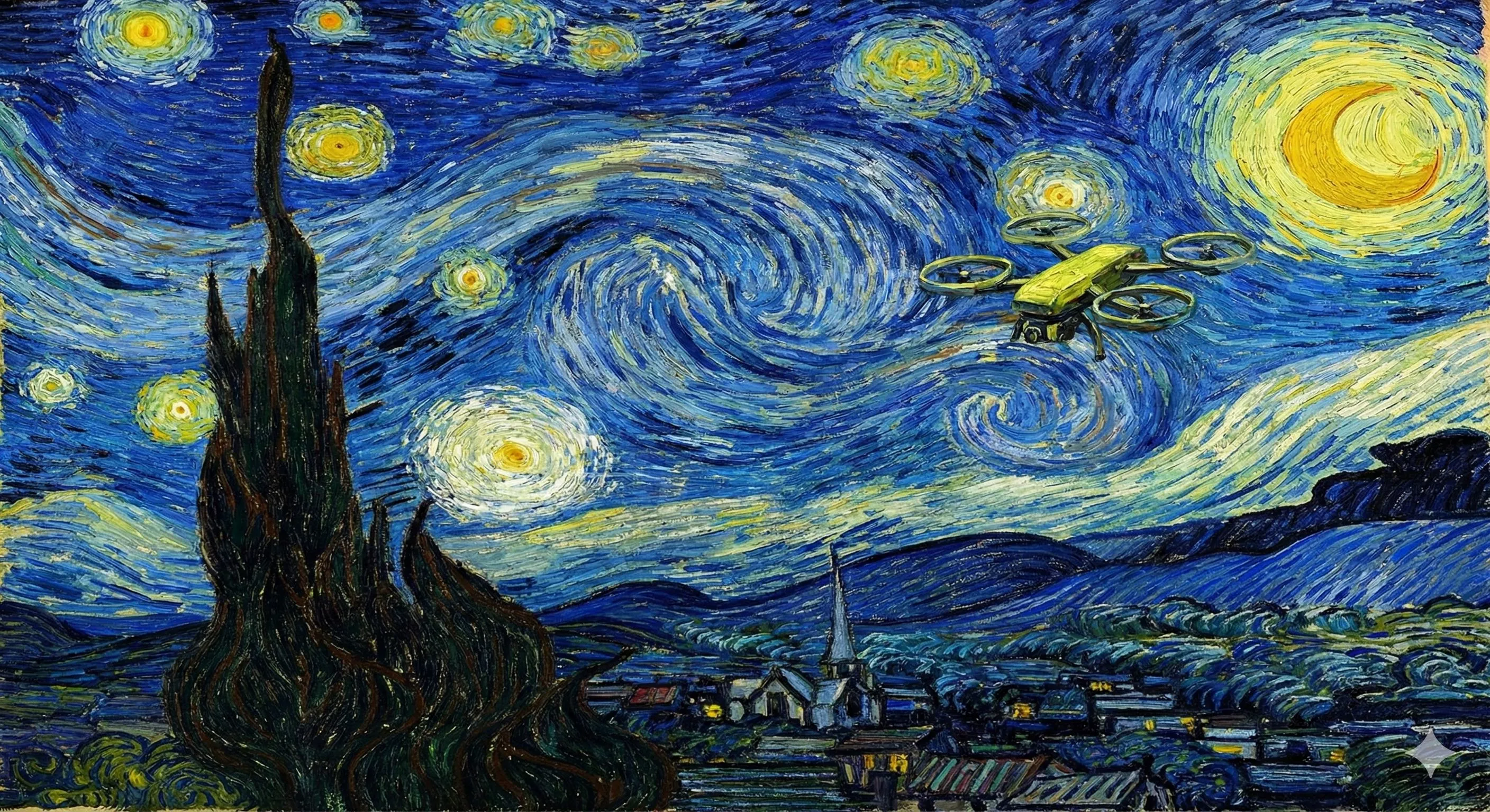
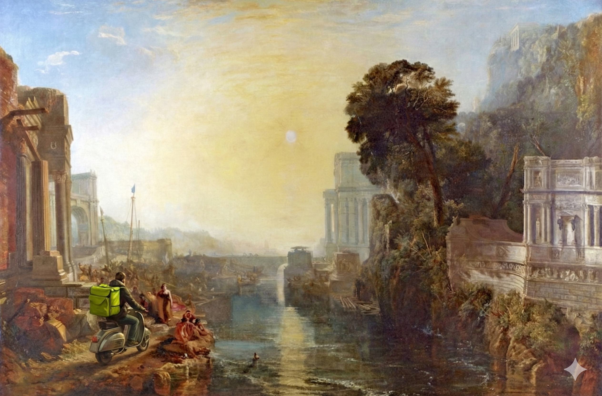
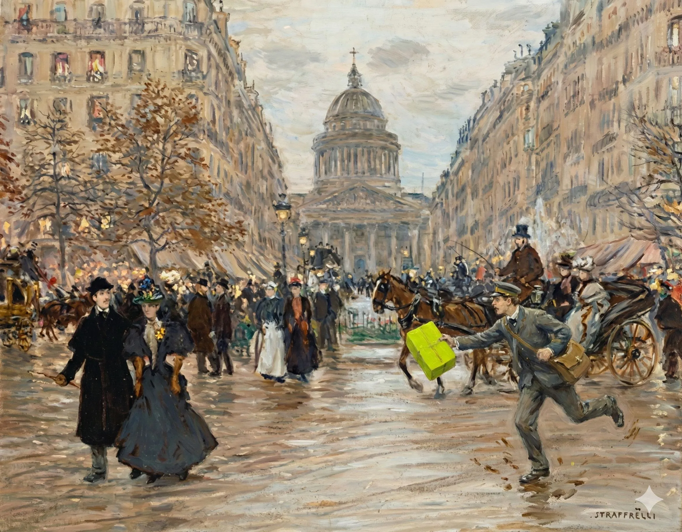
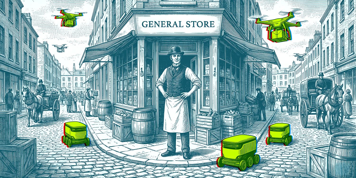
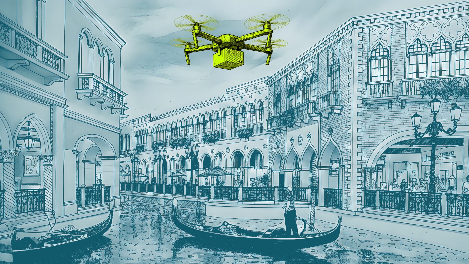
The thesis
Logistics has always existed. Couriers crossed Renaissance squares. Cargo moved through Hopper's New York. What's new is the system underneath. Our illustration places Nash inside that long arc of human movement — quietly, in chartreuse.
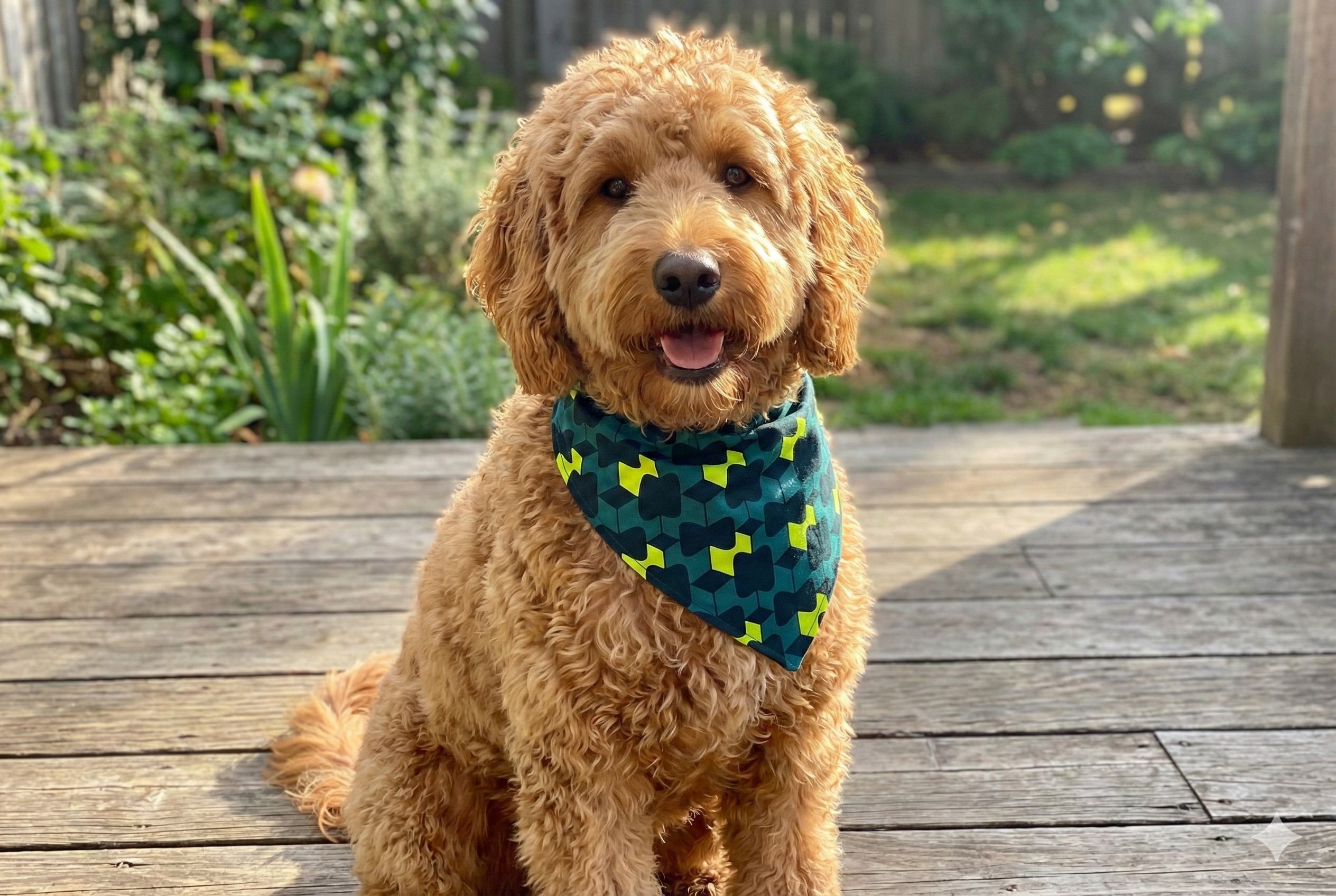
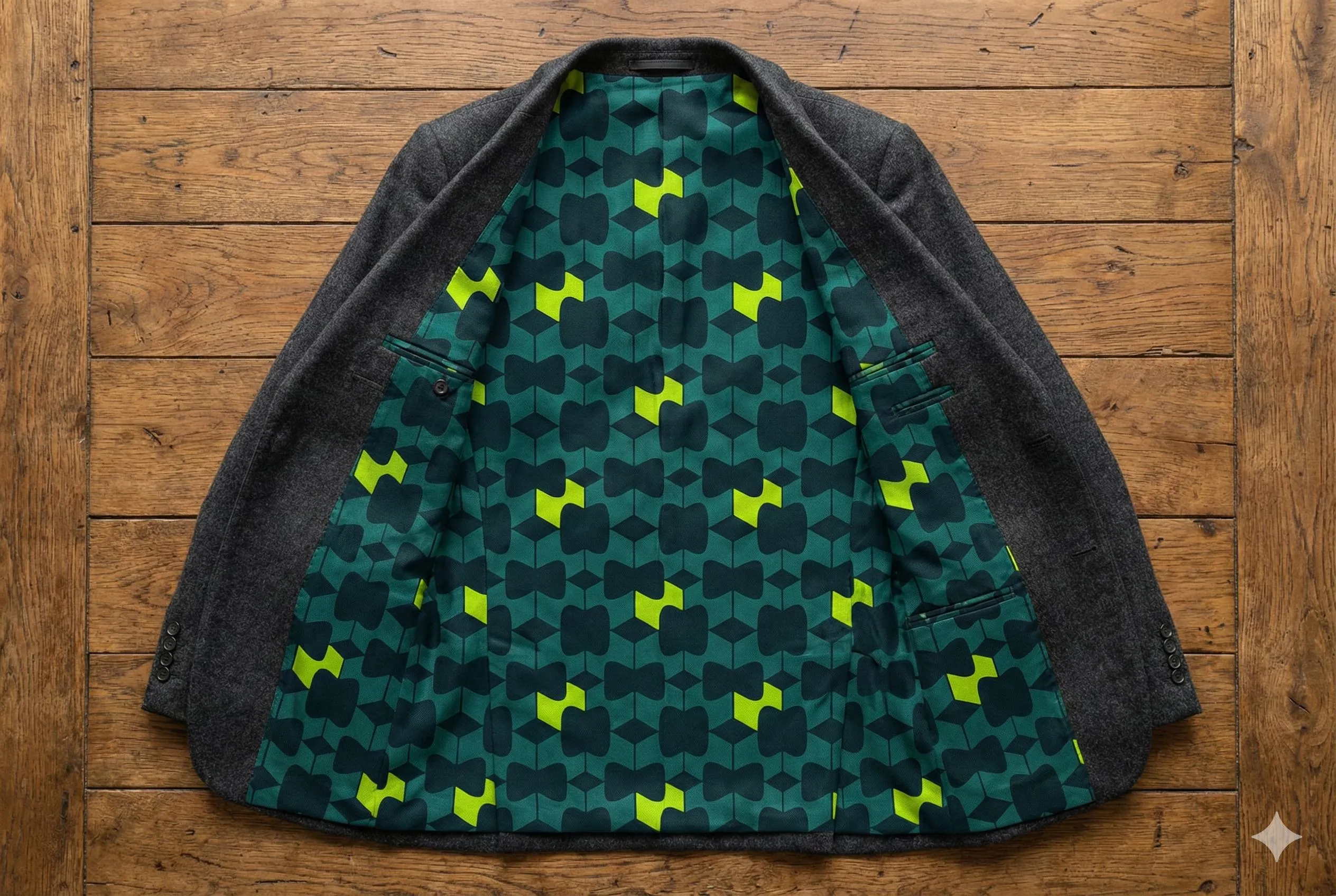
Materiality
In a world of AI slop, we are fascinatingly real. Layered perspex, glass, metal, light, fabric — we treat tangible objects as brand assets and photograph them like they matter.
Voice & tone
We are your most ludicrously well-informed friend about logistics and commerce. Not a megaphone shouting into the void — the friend you invite for coffee to get some advice.
● We are
- Insightful and engaging, with a willingness to go into detail
- Writing like one specific person talking to one specific person
- Using the simplest possible words without diminishing accuracy
- Explaining why something matters, not just what it is
- Serious when the situation calls for it; whimsical when it doesn't
- Unafraid to say the world is hard — and that we're built for it
○ We are not
- A megaphone to shout louder into the void
- Bragging about "AI" — we show outcomes instead
- Using jargon unless it is exact and useful
- Frat boy, jock, or un-inclusive humor. Ever.
- Treating our audience like they don't understand complexity
- Polishing away every imperfection into meaninglessness
Continually adjusting in a world that refuses to sit still. Not by avoiding complexity. But by mastering it. Beautifully. Relentlessly. In motion. Always.— Mission statement
Nash Website & Nash Agent
Two surfaces, one brand. The website carries the public story — atmospheric, motion-rich, aurora-led. Nash Agent is the operating brand — solid surfaces, beam-bordered cards, chartreuse as primary not eyebrow.
Atmospheric, motion-led, restrained signal.
Aurora is the website's primary atmospheric treatment — soft chromatic light bleed behind the mark. Used in heroes and key art only.
Solid, instrumented, chartreuse as primary.
Built for the operating surface. Beam-bordered cards, chromatic mark, scan lines, aurora pill buttons — chartreuse used as primary, not eyebrow.

Components
Live elements pulled directly from the website style guide and the agent style guide. Each demo is the real thing — copy a class and use it.
Aurora button
Hero CTA. Dark glass pill on either theme. Aurora sweeps a 16s loop in the background.
Scan line
across the surface · 4s
Atmosphere effect for terminals, monitors, anything that should feel "watched."
Status badges
Three-level system: ALERT → WATCH → OK. Chartreuse signal reserved for "Nash intervened."
Thinking + typing
Indicators for active agent loops. Chartreuse only — never flat grey.
Beam spinner
Primary loading state for the agent platform — triple-layer conic with chromatic offset.
Buttons — primary & ghost
From the website style guide. Same shape across light/dark — only the inverse pair flips.
Templates
Copy-paste blocks for everyday brand-aligned outputs. Email signature first; more snippets land here as the team needs them.
Email signature · Host Grotesk
Drop into Gmail / Outlook / Apple Mail. Host Grotesk falls back to Arial / system sans on clients that don't load web fonts (most of them, in practice). Replace [Name], [Title], and any optional rows you don't want.
|
|
[Name]
[Title] · Nash
|
<table cellpadding="0" cellspacing="0" border="0" style="font-family:'Host Grotesk',Arial,sans-serif;color:#01051E;font-size:13px;line-height:1.4">
  <tr>
    <td style="padding-right:14px;border-right:1px solid #B1C4DC;vertical-align:middle">
      <img src="https://nash.ai/brand/nash-mark-dark.png" width="40" height="40" alt="Nash" style="display:block"/>
    </td>
    <td style="padding-left:14px;vertical-align:middle">
      <div style="font-weight:600;color:#01051E;font-size:14px;letter-spacing:-.005em">[Name]</div>
      <div style="color:#5A7498;font-size:12px;margin-top:2px">[Title] · Nash</div>
      <div style="color:#5A7498;font-size:12px;margin-top:6px">
        <a href="https://nash.ai" style="color:#01051E;text-decoration:none;font-weight:500">nash.com</a>
      </div>
    </td>
  </tr>
</table>Downloads
Source files. Click any tile to download. Source SVGs are transparent — pick a fixed background below to bake one in (PNG export). For anything not listed, email marketing@usenash.com.

Need something specific?
Custom lockups, photography sets, animation kits, or co-branded assets — email the brand team and we'll route it.